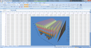
Below is a screenshot of the 3d graph I was able to make in excel.

If we can manage to use the data that we collect to come up with evenly spaced X and Y points (easy through interpolation, weighted averages, etc...) we should be able to generate these graphs easily. We could even use OLE controls to make the process transparent to the end user (of course this would require the user to have excel and windows installed, and we'd have to use ruby or something because Java doesn't support OLE to my knowledge).
No comments:
Post a Comment